How to Design an Embroidery Graphic That Works
Embroidery has been one of the biggest fashion trends for a hot minute. From Dad Hats to Jackets, embroidery is everywhere. But a lot goes into making a quality piece of embroidered apparel. Designing for embroidery is a little different than designing for screen printing, so we’ve put together some tips to help get your graphic embroidery ready.
Acceptable Files
Submitting the right type of file is the first step to ensure your embroidery project is the best it can be. Raster or Vector files are required to get the order process rolling. Here are the specifications for each:
Raster Files
- Photoshop, Tiff, JPG and some PDF files
- Artwork must be the exact size you wish to embroider or larger
- 300dpi or higher resolution
- .2” or larger text (22-24 pt. depending on font)
- No fine detail
Vector Files
- AI and EPS files
- Linked images must be embedded or provided as a separate file
- Fonts must be outlined or provided as a separate file
- No fine detail
- .2” or larger text (22-24 pt. depending on font)
 Things To Keep In Mind
High quality embroidery comes from files designed for thread. Here’s what to avoid and keep in mind when creating a design to be embroidered.
Small Details
Embroidery can’t quite produce the fine details that screen printing or dye sublimation can due to the decorative thread being a less versatile, less precise medium. Keep this in mind when designing and avoid aspects like thin lines, narrow spacing and small text. Keep text at the minimum .02” or larger.
Fine, light colored lines might not turn out as expected. Fine lines are created with with a series of thin stitches, and the negative space between stitches can make thin lines look more like dotted lines. Darken up any fine lines and details to ensure they show up in the finished product.
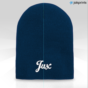
The apparel you choose can affect embroidery in a few different ways. Hats have limited space to embroider, so it’s important to check the specs of the front of the hat so your design is the appropriate size. Material is also important to keep in mind. For example, embroidery will look a lot different on a beanie than it will a work shirt. The material of a beanie is fluffier, so finer details will be lost easier than they would be on the more rigid material of something like a work shirt.
Color Matching
We offer around a 100 different color threads and can order additional colors if your project calls for it. We also offer Pantone matching, but bouncing light can cause the thread to look lighter or darker in certain areas and at certain angles.
Good Embroidery Files
Now that you know what to avoid, aim for these standards when you’re designing for thread:
- Bold lines
- Avoid fine details
- Large elements
- Correct size for garment
This image from Accidental Comedy is a great example of a good embroidery file. With bold lines and no fine details, the artwork translated to thread perfectly.
—
Still unsure if your graphic will work for embroidery? Don’t worry! Send us your artwork and our awesome Embroidery and Digitizing Departments will check out your files. They’ll let you know if any changes need to be made and can make suggestions to make your project look incredible.
Pump up the cool factor on your project with our specialty threads and custom embroidery effects.


