Picture-Perfect: Screen Printing Photographs
A lot of cool products roll through the shop here on a daily basis. Occasionally something that really catches our eye comes along-in this case; a t-shirt by Toledo, Ohio Based photographer and videographer, Nick Amrhein. Nick used his creativity and incredible skills behind the camera to make a killer t-shirt. Screen printing an insanely photo-realistic shirt that retains all of the detail of the original photo can be tricky, but our expert screen printing team knew exactly how to take care of business.
Seriously impressed, we sat down with Nick to hear his story and learn more about the idea behind his shirt.
So, how did you get into photography and video?
When I was 15, I started shooting skateboarding videos. My friend had an old VHS camera, and we started filming each other, that’s when I fell in love with shooting. It just grew from there. I interned in California with Loyalty Creative and Kevin Ou, a fashion and celebrity photographer. Now I’m the co-founder of Common Creatives Studio and spend my days working with businesses, agencies and publications on shoots. Doing what I love as a career makes every day amazing.
Tell us about the photograph you used for the shirt.
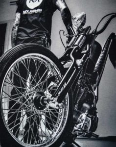
The photo on the shirt is of biker Noah Wolfe AKA Nachos. We were celebrating his birthday along with a few other motorcycle friends a few months ago when I decided to bring out my Fuji x100 camera. Snapping shots of the crew and capturing the camaraderie between these guys inspired me to focus on the motorcycle scene. I’ve been working to brand my photography and video in the scene and making it my niche. I wanted to produce a shirt that not only promoted my photography but my interests as well.
One of your shirts is in the photo. That’s a clever marketing move!
Nacho is wearing one of my photography logo shirts. If I just put my logo on a shirt then chances are a biker isn’t going to want to buy it. This shirt markets to both worlds, so I’m appealing to my target demographic and and getting my name out there. Killing two birds with one shirt.
 Do you have any big projects in the works?
I love photographing people. I’m working on a series called PUMP STRONG about Type 1 Diabetics that wear insulin pumps. I want to portray the diversity of people with Type 1. I have Type 1, so I’m stoked to showcase that demographic and let people know we can do anything we set our minds to, despite the disease. I’m also working with Parr Moto, the advertising agency for Harley Davidson, on a video. This is really something big for me!
 Behind the Screens
Knowing the backstory, we wanted to know what went into making this shirt look so fantastic with its depth and details that pop. We asked Kyle Knutson of our Color Separation team for the behind the screens scoop.
What exactly is color separation and how important was it to this product?
Color separation is breaking down the image to be printed into individual colors. A photograph can have numerous shades of color, so boiling it down to the right ones is super important. Getting the right shades in the right places can really make or break a print.
Was it different working with a photograph as opposed to a digitally created file?
We see a lot of digitally created files, so it’s a treat when we get to work with something a little different like photo-realistic files. This one was particularly nice to work with because of its high contrast.
Why was the high contrast nice to work with?
The contrast in the image was very important for separating and picking the colors. I was able to use different shades of grey to make the print as close as possible to the original image.
 How many inks went into this shirt?
Using a base ink, two greys, a white ink and the black of the shirt, I was able to create this simulation. The white was used for the text and the highlights in the motorcycle. A combination of a light and dark grey were blended together to create depth. The base was used to make the colors pop and help create a smooth, crisp print.
Were the inks applied in a certain order to make this shirt look so great?
The order inks are set up on the press help keep images from looking muddy. We ran inks from the darkest to the lightest to make sure the darks stayed dark and the lighter colors popped.
—
Nick’s photography combined with the experts on our Color Separation and Screen Printing teams produced an outstanding piece of apparel that will earn plenty of double takes. Find out more about the screen printing process and get inspired!

