
Translation Please! Color Lingo In Print
Print lingo can get pretty intense, but we’re here to act as your translator so you can send your projects to the press with confidence. Color is an integral part of your print project, and having a grasp on the print lingo associated with it is just as important as your finished product. We want your project to be the best it can be, so we’re breaking down the different color models to make printing color confidently a breeze.
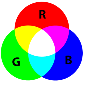 RGB
RGB

RGB is broken down into red, green and blue. RGB is a light based color model, so it is the model of choice for digital design and anything on an electronic screen. RGB is an additive process, so more light means more brightness. This color model is used in digital design to create web-safe colors that will display the same or similarly on a variety of monitors. However, every computer monitor is calibrated differently when it comes to brightness and hue. So even though an RGB system is used, the color you see on your screen might not be exactly what someone else sees.
RGB files are also used in screen printing. Our Color Separation Team will hand separate the colors in your file and match each color to a specific Pantone ink.
Monitor calibration is important to keep in mind when it comes to digital proofing. Digital proofing is faster and more economical, but we suggest requesting a hard copy proof if color accuracy is a priority.
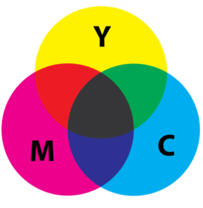 CMYK (Process Printing)

Cyan, Magenta, Yellow and Black make up this color model that is used by a vast majority of the full color print process. The four colors are layered in different quantities to make specific shades, and formulas are developed to achieve colors. Rich black, a mixture of CMYK colors to make a deeper shade than black ink alone, might look something like C=30 M=30 Y=30 K=100. CMYK is a subtractive process, so more ink means less brightness.
CMYK printing is not guaranteed to produce the same results 100% of the time. There’s room for some color variation from run to run, so the color on a reorder of a print job might differ from the first. But don’t let that alarm you! The difference is pretty negligible, and we offer custom Pantone inks if color is imperative to your print project. We can also match colors on orders you’ve previously printed with us to keep your colors consistent. Just let us know and keep a sample of your last project handy so our press operators can match your new project to it.
This handy video dives a little deeper into the difference between CMYK and RGB.
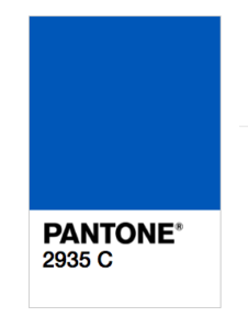 PMS (Spot Colors)

PMS, or Pantone Matching System, is a system designed by the Pantone Color Institute that standardizes colors. This means different people in different locations can refer to the PMS and produce the same color. Each Pantone is assigned a different number and put into PMS swatch books to make referencing and finding the right hue a breeze. We offer over 1,114 custom Pantone inks to ensure that the color used is your color. We even offer fluorescent and metallic tones to add some print pizzazz .
When color is a top priority for your Letterheads, Apparel or Stickers, providing a custom Pantone is the way to go. Unlike CMYK, spot colors are premixed to perfection so there is less room for color deviation from run to run.
—
Now that you know the lingo, you can have the comfort of knowing that the color of your print job is going to be exactly as your dreamed it would be. Now that you’ve mastered color lingo, dive into our finishing options to perfect your project.