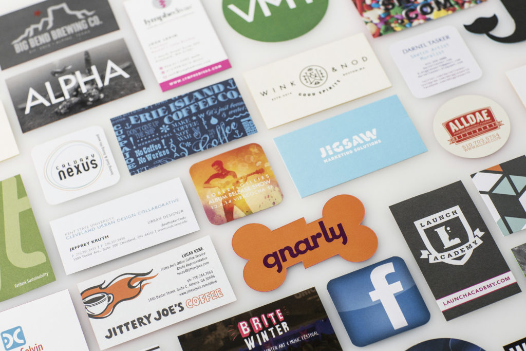
Business cards have been around for centuries. They’re a staple for every business, socialite, student, designer and everyone in between. But with networking sites like LinkedIn and other ways to connect digitally, business cards have transitioned from a requirement to a statement piece. A good looking business card is the perfect chance to show off and ensure you’re leaving the impression you want with your audience. Paper stocks, custom die cuts and painted edges are just a few ways to leave a great first and lasting impression.
Congratulations, your mixtape is finished! You’ve created a list of tracks you are proud of, your sound is polished and you’re ready to get your work out to the public! But wait, before you take to Twitter to spam your feed or flood your friend’s Facebook timelines, take a step back to think about your promotion strategy.

Proper branding and promotion of a mixtape are often what stands between an artist that gets noticed and one that fades into obscurity. The market is over saturated with musicians who have no idea how to get people to listen to their music once their mixtape is finished.
Business cards are a fantastic way to get creative when promoting and marketing yourself. Sure, if you’re a Wall Street banker you’ll want to stick with a subtle off-white coloring, tasteful thickness, maybe even a watermark– but we think you’re looking for something a little more… cutting edge.
Because we could.
This is the answer to the inevitable “why we did it” that you will ask. We were sitting around and wanted to really show the difference that paper stock can make. Sure, we could have pulled out our micrometer and made some charts. But, does the internet really need more infographs right now?
So, you think you should save a few bucks on your next business card order. Any of these sound familiar?
- “I’ll just go GarbageBusinessCards.net and get some of those free cards.”
- “Hey, can you grab me some of those perforated sheets down at Office Shack?”
- “Doesn’t the copy shop on the corner have clip art you can choose from?
We’ll level with you: Sure, we’d love if you printed your next business card order with Jakprints. But, this article isn’t a sales pitch. This is a motivational speech for investing in you and your business. You don’t have to buy an expensive business card to look good, you only need to avoid a card that looks cheap.
Here at Jakprints we love looking at all the great ideas that our customers come up with. Check out these phenomenal Business Cards that have crossed over our desk recently.
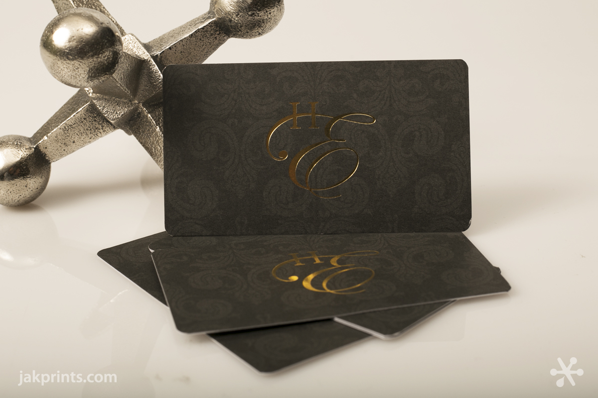
1. We love the look of this 16 pt. Soft Touch Business Card. The sleek design pairs perfectly with our Soft Touch coating — it gives paper a satin finish and a touchable, rubbery feel. Their use of gold foil stamping keeps it both simple and elegant. Every detail is covered in this design, even the slight rounded corners to soften the look of the final piece. Marvelous!
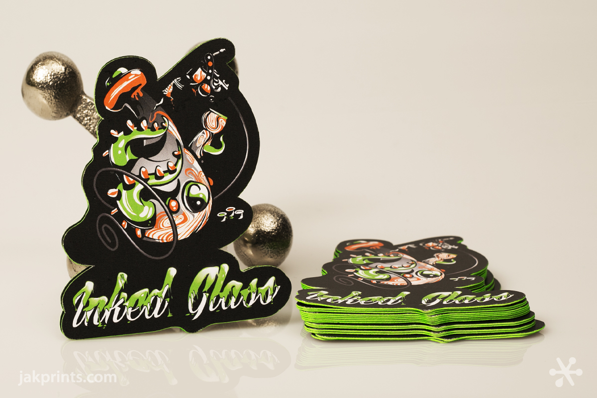
2. Our friends over at Inked Glass really wanted to make their artwork pop. With the use of a custom die line and neon green painted edges they definitely have a card you won’t forget.
It’s time to be depressed! Everyone gets excited about a nice, embossed Business Card. Hell, we’ve seen billions of cards and embossing still stops us in our tracks.
To produce an emboss, your graphic is etched into two copper plates: the Plate (male die) and the Counter (female die). Acids are involved with the etching, it’s seriously pretty awesome.
Your final print is then stamped between the plates. The dies complement each other so that when the stock is forced between them it causes the fibers to take their final, embossed shape. Debossing is a similar (and often misunderstood) process where the paper is stamped without the counter die. This results in recessed type and logos without the corresponding raised area on the reverse side.
Embossing works best with one-sided business cards, as your text and logos will appear backwards on the flip side. To avoid this subsequent effect, consider using organic textures or symmetrical patterns so that the areas that extend beyond the surface are viewable from both sides.
Keep in mind that type and other small design elements should be spaced further apart than normal, as the embossing can otherwise cause close shapes to merge together. On business card stock, use 2 pt. line weight, and at least a 10 pt. font for all text.
The plate and counter dies generally add about $100-250 to the cost of producing business cards, so double and triple check your spelling and make sure that your contact information is set in stone for the foreseeable future.
If possible, avoid making your name or phone number three-dimensional so you will be able to reuse the same embossing dies on re-orders, or if you have multiple sets of business cards to order for additional employees.
You don’t need us to tell you how vital new relationships are in business. So, how do you make a lasting impression in a world filled with the ephemeral? Well… a great personality is probably your bet. Unfortunately, you can’t buy one of those. But you can buy an awesome, well-design Business Card. What’s the look like?

