How to Design for White Ink
Combined with colored paper stocks, white ink is one of the coolest ways to take your designs in a new direction. Use this fifth color to create truly unique designs and effects.
But, unless you’re used to using white ink, some of these techniques might seem a bit illusive. Fear not! We’ve got some great examples of white ink being used in designs and some insights about how to use it.
If you’ve already created a white ink design, pop over to our tutorial on how to set up your Adobe Photoshop and Illustrator files for printing.
To get a firsthand view into how designers are leveraging white ink, we sat down with designer and illustrator Nick Matej of downtimecollective.com.
White As A Fifth Color

This greeting card uses a white gradient to create opaque, white clouds without big billowing pillows bulking up the image. To create this kind of effect, Matej used layers with varying opacity on the white elements.
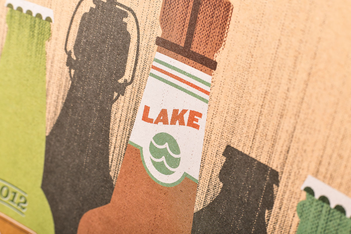
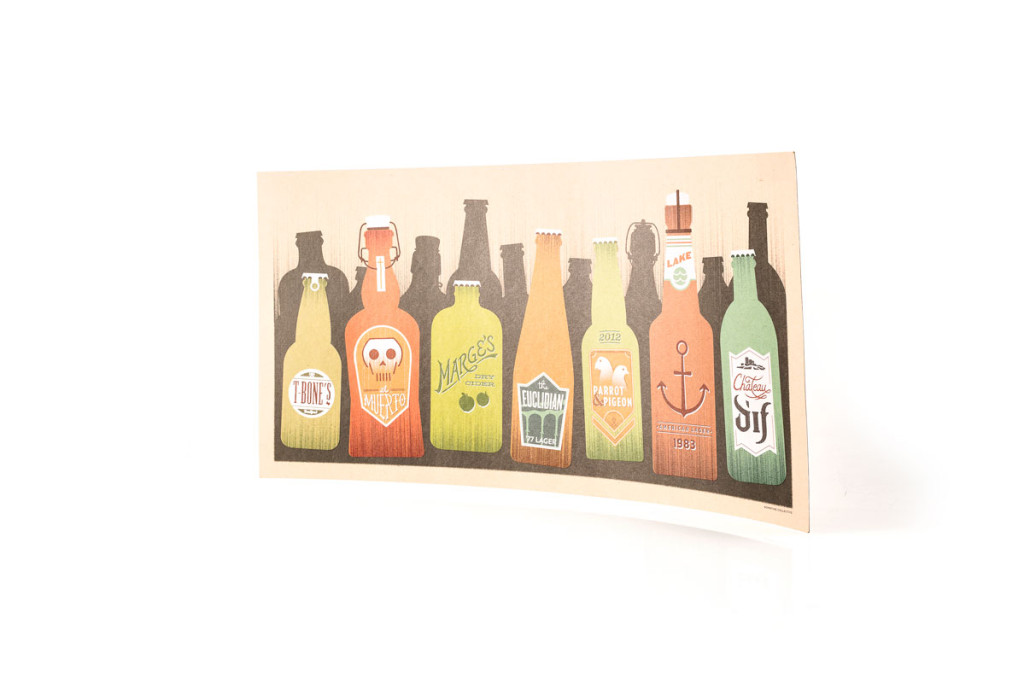
Usually, with a full color image we put down a layer of white ink to make the image stand out against the cardstock.
“The shape of the reindeer and hills were left blank so that the color and texture of the Kraft stock paper is showing,” says Matej. This adds a wonderful depth to the illustration that wouldn’t be available with any other print process.
Matej explains that designing with white ink works best for limited-color art instead of full-color images. White Ink was used here to create the snow on the hills and the details on the deer. The gradient gives the image a vintage, screen-printed feel that can’t be recreated with your average CMYK printing, “I like to use the white in order to simulate aspects of screen printing but keep within a tight budget.”
Playing With Opacity
For this image, Matej set the white of the glasses to 75% opacity so that they have the appearance of actual transparent glass. This effect works with the other color elements in the design to create this effect.
Playing around with opacity is a unique and important effect to keep in mind when designing with white ink. Not only for the overall look of the design, but for how the final printed product will look. If you want a lower opacity, the white parts will have less of a pure white look but have a transparent effect.
Full Color Photos & White Ink
Before we print your design on colored paper, we put white ink down as a base behind full color images. Doing this first makes designs pop and makes colors more vibrant. It also helps make what we print on our stock paper look more like what your design looks like on traditional, white paper.

White Ink Isn’t Magical
White ink is rad; but, it isn’t pouring out of magical cauldrons: it’s neither perfectly white nor perfectly opaque. As we lay down more white ink, it can look thick and glossy in stark contrast to the paper’s natural, uncoated sheen. This is especially apparent on the darkest stocks where white inks will have a slight, bluish tint. Your prints will still look awesome; but, it’s important to know what to expect.
Learn More
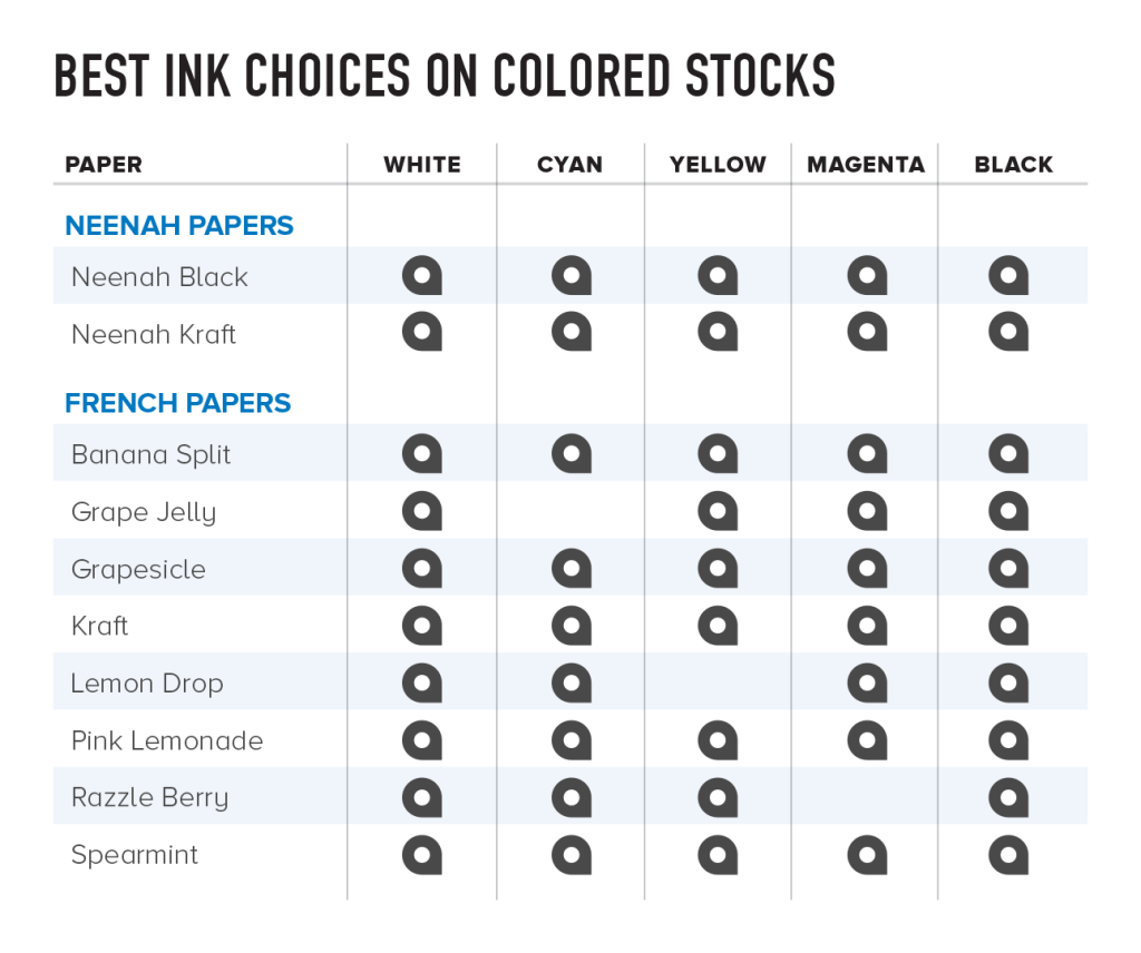
This table indicates which colors work best on each of our paper stocks and which colors will not show as well.
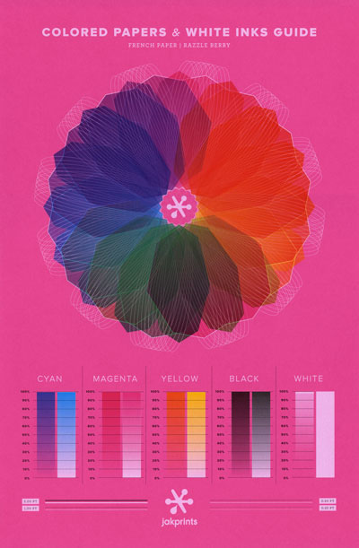
Contrast is key when designing with white ink. We suggest using mid-tone or darker stocks to help the white ink stand out. When printed on a light stock, like pink, white ink will be nearly impossible to see because of the low contrast between the two colors. Keep in mind while designing that the clarity and overall look of your final product will vary quite a bit depending on the texture and color of the stock you use.
To see how your white ink design will look on colored paper stocks, visit our FAQ page where you can download hi-res scans of the stock you are looking for. On this page you’ll find downloadable samples showing exactly how white ink will show on our different colored french and Neenah paper stocks.
Now that you’re inspired, we suggest you start by downloading a template for the product you are designing from our website. Using a template will help you get a better idea of what your final product will look like.
If you have a specific way you want your design to look with the white ink, feel free to add a note when you place your order describing exactly what you want or feel free to contact us with any questions.