Print lingo can get pretty intense, but we’re here to act as your translator so you can send your projects to the press with confidence. Color is an integral part of your print project, and having a grasp on the print lingo associated with it is just as important as your finished product. We want your project to be the best it can be, so we’re breaking down the different color models to make printing color confidently a breeze.
You’ve spent hours on every line and brush stroke; you’ve waited for the perfect natural lighting before snapping that photograph. Now comes the hard part: putting your artwork in the hands of the public.
Creating prints of your art makes your work more affordable and accessible to a wider range of audiences than selling solely originals, but not all prints are created equal. Anything worth printing, is worth printing well; don’t settle for a faded image on flimsy paper. This won’t do justice to your art and it won’t produce a product your audience will want to hang in their homes.
Creating and selling prints is a ‘make or break’ process. If not approached correctly, your prints can either create revenue or bleed you dry.
Whether you’re a printing veteran or just beginning the venture into selling your art, having quality prints is a step in the right direction. If you’re feeling overwhelmed with options for creating prints of your artwork, have no fear. We’re about to walk you through the pros and cons of one of the most popular art print options, Giclées.
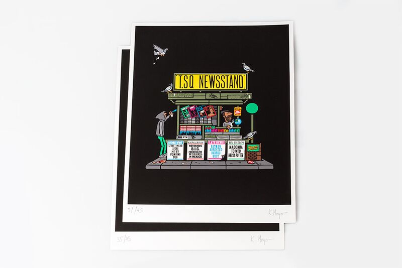
T.SQ Newstand by Grotesk
Screen Printing is a printing method where ink is driven through a stencil with a squeegee– but you probably knew that. It’s all the other jargon that can feel like the screen printing business has its own language. Here’s a comprehensive list of terms, inks and equipment to help you understand what’s going on and get going with your next print project.
 Terms
Terms
All the terms you might hear thrown around when researching screen printing.
Bit Map– an image created on a visual display unit where each pixel corresponds to one to more bits in memory, the number of bits per pixel determine the number of available colors. Bitmapped graphics is often referred to as raster graphics.
Screen printing is a lot like painting with a roller. On a flat wall, the paint will go on evenly and smooth. When the roller hits a bump in the wall, it skips a space and there is a break in the color, a little gap that the paint doesn’t hit. Fleece hoodies are mostly smooth unless you hit a zipper or pocket. Luckily, we’re experts at Jakprints and we have the know how to work around these limitations.
Apparel with non-traditional print areas is extremely popular right now. But, this type of printing often comes with its own challenges, like how to get your design to look good while printing over seams and zippers. This can be tricky but not impossible and the final products are always worth the effort. We sat down with Jeff Wisenberg, head of Apparel Production here at Jakprints, to get some tips and information about the process of printing over zippers.
We sat down with some of the best and brightest Jakprints employees, LT Magnotto & Jeff Wisenberg, to talk about the ins and outs of screen printing.

LT has worked in color separation at Jakprints for more than a decade and is considered one of the best in the industry.
Color separation is the process of breaking down a full color image into a few colors so that it can be screen printed without the eye seeing the limited number of colors.

Jeff has the honor of being the very first employee of Jakprints. He’s put in 16 years of hard work to help build the foundation of what we have today. Jeff is the head of apparel production, making sure they have everything they need in order to make the best possible product.
Tips for Screen Printing
Some designs work better for screen printing than others but, as LT says, “Everything works, we won’t turn any projects away.”
This post was published and formated for an old version of the blog.
Did you know that your artwork can be placed almost anywhere on a piece of apparel? Jakprints is leading the pack with the amount of customization options we offer, and our quality is second to none. Around here we encourage thinking outside the box, so be as creative as you want with your custom shirt printing.
Check out resident Apparel Guru Angie Franklin as she provides insightful advice on “where” and “how big” to apply graphics on your next apparel order. She will help you master the art of t-shirt design by providing helpful hints about Max Print Areas and Anchor Points, as well as guide you through some of the possible results when printing over non-conventional image areas.
This post was published and formated for an old version of the blog.
As part of our newest educational series we are looking at the differences between CMYK and RGB color modes and what print processes they work best for.
This post was published and formated for an old version of the blog.
As part of our partnership with music industry heavy hitters, Digital Music News we are providing articles for their email publications as well as their website.
Our latest article:
This post was published and formated for an old version of the blog.
What’s a Clear Sticker? Glad you asked. Instead of telling you we thought showing you would be best. Clear Stickers are great label alternatives if you’re on a budget but want a custom shape for your design. Fantastic for application on windows, glass, beer bottles or mirrors. The possibilities are endless and did we mention there’s a unicorn?
Have you used Clear Stickers before?
How did you use them?
Post a pic in the comments!
What other product showcases would you like to see?
Let us know in the comments!
This post was published and formated for an old version of the blog.
The Berklee College of Music recently asked Jakprints, as a progressive authority in the printing and apparel industry, to create an educational video series to use in their curriculum.
In this video, industry experts Jacob Edwards (Founder and President) and Nick DeTomaso (Director of Operations) share insights and advice on how to get started when marketing your music and yourself as a brand and musician. Drawing on years of experience and deep roots in the music industry, Jacob and Nick touch on everything from the still relevant, one-color black t-shirt, to the fact that marketing and branding are necessary to the survival of the independent artist or musician.
A Few Key Take Aways From The Video:
- Merchandising Is The Future Of The Music Industry
- Keeping It Simple Will Give You The Highest ROI
- A Consistent Brand Is The Key To Success
Script:
Episode 1: Music Marketing & Merchandising


